ME Bank
At ME Bank, we worked hard to design a banking app experience that customers truly loved. Along the way, we redefined the home loan experience, and built a world-class design system.
At ME Bank, we worked hard to design a banking app experience that customers truly loved. Along the way, we redefined the home loan experience, and built a world-class design system.
At ME Bank, we worked hard to design a banking app experience that customers truly loved. Along the way, we redefined the home loan experience, and built a world-class design system.
About the project
I joined ME Bank in June 2019 to join their existing UX team. ME was in a state of transition - most of the bank's technology was built on white-label solutions, limiting our ability to deliver modern, scalable experiences to our customers. A big part of my remit coming into the business was to identify opportunities to transition the bank toward customizable experiences that could deliver greater value to their customers. This involved implementing a number of UX practices, as well as building and testing new products and features.
I joined ME Bank in June 2019 to join their existing UX team. ME was in a state of transition - most of the bank's technology was built on white-label solutions, limiting our ability to deliver modern, scalable experiences to our customers. A big part of my remit coming into the business was to identify opportunities to transition the bank toward customizable experiences that could deliver greater value to their customers. This involved implementing a number of UX practices, as well as building and testing new products and features.
I joined ME Bank in June 2019 to join their existing UX team. ME was in a state of transition - most of the bank's technology was built on white-label solutions, limiting our ability to deliver modern, scalable experiences to our customers. A big part of my remit coming into the business was to identify opportunities to transition the bank toward customizable experiences that could deliver greater value to their customers. This involved implementing a number of UX practices, as well as building and testing new products and features.
Date:
May 1, 2021
Client:
ME Bank


Mobile App Refresh
In early 2020, the decision was made to overhaul our existing ME Bank mobile app to a new, upgraded version. The mobile app was built on a third-party white label solution, so the primary task of this overhaul was to assess the white label product for suitability, and then overhaul the look and feel to match ME's brand.

Gap Analysis & User Testing
We began the process by painstakingly analysing the screens that the vendor had provided of their product. There were over 200 screens in the delivered file, and we compared each screen to the current state of our 'V1' application. We then listed every change to the user experience, from high-level changes such as completely different flows, down to changes in UI controls or information presentation.
Each of these flows was analyzed using the Jobs to be Done model, which allowed us to understand how these journeys would function both on a UI level, but also at a deep customer level. We would later take this information and use it to inform our design decisions.

Look and Feel
With key areas of the app identified, and with some initial user feedback on preferred input methods and journey flows, we began overhauling the vendor app to fit with ME Bank's brand.
ME Bank has traditionally stuck to a black and white colour scheme, but many complaints from customers on the App Store and Play Store identified that they'd prefer more colour and excitement. This was a core focus for us as we moved through the screens - retaining our monochromatic look and feel, but injecting some vibrancy where we felt it had an impact.
We also made a conscious effort to maintain a modern, clean design. Our V1 app was cluttered and claustrophobic, and many users felt it was unpleasant and difficult to use. We wanted V2 to feel bright, open, and simple. Generous white space and strong typography were key in accomplishing this.


Screen Gallery
Consistent visual language was key in communicating the correct concepts to our customers. For example, using black screens for the end of a journey, or using our green colour only on interactive or positive elements, was something that assisted new users in understanding the UI.
Screen Gallery
Consistent visual language was key in communicating the correct concepts to our customers. For example, using black screens for the end of a journey, or using our green colour only on interactive or positive elements, was something that assisted new users in understanding the UI.
Screen Gallery
Consistent visual language was key in communicating the correct concepts to our customers. For example, using black screens for the end of a journey, or using our green colour only on interactive or positive elements, was something that assisted new users in understanding the UI.

Before and After
One of the primary goals of the app upgrade was to provide a brand new look and feel that uplifted the app, making it feel modern and efficient. The screens below demonstrate how each screen of the app was uplifted, and really showcases how much of a difference a simple facelift can make.
Redefining Home Loans
My team and I joined ME Bank with the mission statement to help the bank identify how to become a first-choice bank for mortgage brokers. We were given full creative control on how we accomplished this outcome, and so immediately began planning how we could execute the work. We knew that it would be vital to be able to communicate not just the outcomes, but also the journey of how we came to our conclusions. We also understood that there would likely be a number of complex solutions requiring coordination across the business.

Project Poster
To help promote the goals of the project, and to share what we're working on with the wider team, we built a project poster following the Atlassian Project Poster model. I spruced up this artifact so that we could post it around the building, with the hopes of generating interest in what we were doing.
Customer Interviews & User Journeys
I felt that understanding the perspective of our customers - just like any other UX project - would be crucial for our success. In this case, we had multiple customers in the journey; the home buyer, the mortgage broker, and our internal teams that process the home loan applications. We scheduled interviews with all three of these groups, sitting down with them in face to face settings and walking through their home loan journey.
We discovered that each customer segment had completely different challenges. Customers were frustrated with the complex, slow experience. Brokers want as much information as possible to provide to their customers. Our internal teams want to meet their SLA's and work efficiently and easily.
As we moved forward in the project, these interviews became vital resources that we would return to almost everyday, keeping us as close to the customer as possible.
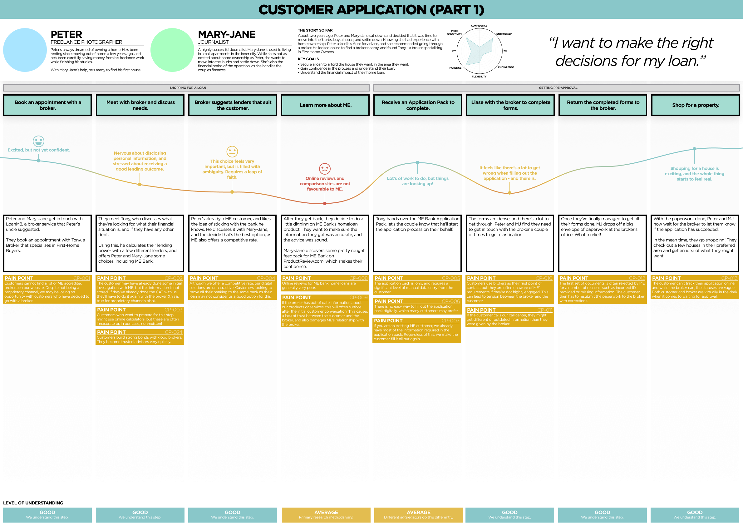
From these interviews, we created complex user journey maps. These maps also combined with some process and service mapping, giving us a holistic view of what's happening with the customer, broker, and ME Bank at any point in the process.
We broke these journey maps down by customer segment, and by phase of the journey. This gave us a detailed, easy to digest view of how the home loan process happens.
We also mapped every pain point we had discovered through our research. There were hundreds of these pain points, spread all across the journey. This allowed us to see where our pain points 'clustered', and therefore which parts of the journey are most fraught. This also allowed us to create a matrix of these pain points to understand the impact and feasibility of resolving them.
Customer Interviews & User Journeys
I felt that understanding the perspective of our customers - just like any other UX project - would be crucial for our success. In this case, we had multiple customers in the journey; the home buyer, the mortgage broker, and our internal teams that process the home loan applications. We scheduled interviews with all three of these groups, sitting down with them in face to face settings and walking through their home loan journey.
We discovered that each customer segment had completely different challenges. Customers were frustrated with the complex, slow experience. Brokers want as much information as possible to provide to their customers. Our internal teams want to meet their SLA's and work efficiently and easily.
As we moved forward in the project, these interviews became vital resources that we would return to almost everyday, keeping us as close to the customer as possible.
From these interviews, we created complex user journey maps. These maps also combined with some process and service mapping, giving us a holistic view of what's happening with the customer, broker, and ME Bank at any point in the process.
We broke these journey maps down by customer segment, and by phase of the journey. This gave us a detailed, easy to digest view of how the home loan process happens.
We also mapped every pain point we had discovered through our research. There were hundreds of these pain points, spread all across the journey. This allowed us to see where our pain points 'clustered', and therefore which parts of the journey are most fraught. This also allowed us to create a matrix of these pain points to understand the impact and feasibility of resolving them.


Communicating to the wider business
Once we'd identified all our pain points, and the customer impacts of those pain points, we began formulating a future state for the business to aspire to.
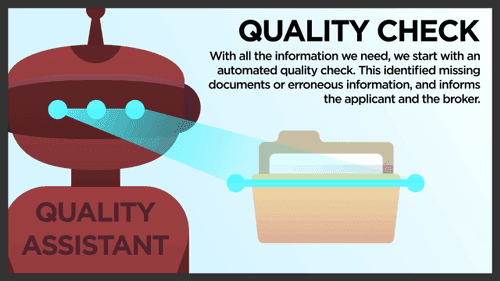
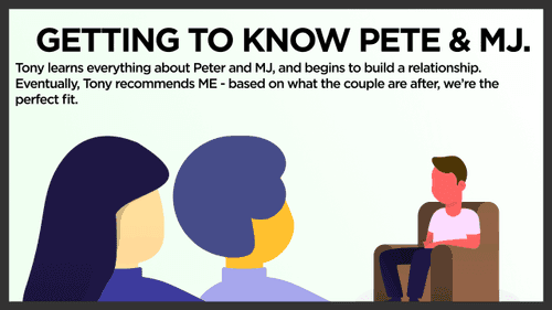
With this future state developed and validated with our customers, the next challenge was to communicate it to the wider business. I set to work on creating a story-driven presentation that put our audience into the shoes of the various customer segments, and helped them understand how the changes we were proposing would significantly improve our customer experience.
The presentation itself was a combination of ME Bank's brand look and feel, and my personal design style. I used basic illustrative assets to convey the story where possible, and paired these with simplified, quick language. The point of this presentation was not to convey the technical of logistical challenges, but simply to help our audience empathize with our customers.
Communicating to the wider business
Once we'd identified all our pain points, and the customer impacts of those pain points, we began formulating a future state for the business to aspire to.
With this future state developed and validated with our customers, the next challenge was to communicate it to the wider business. I set to work on creating a story-driven presentation that put our audience into the shoes of the various customer segments, and helped them understand how the changes we were proposing would significantly improve our customer experience.
The presentation itself was a combination of ME Bank's brand look and feel, and my personal design style. I used basic illustrative assets to convey the story where possible, and paired these with simplified, quick language. The point of this presentation was not to convey the technical of logistical challenges, but simply to help our audience empathize with our customers.
Evergreen assets
This presentation became something we came back to again, and again, and again. It was a great tool to help business owners, developers, designers, and customer service staff understand the goals of the project
.While most of our recommendations to ME Bank will take years to complete, many of the ideas and solutions we created have since been implemented and ME Bank's home loan experience continues to evolve and improve.
