GameCase
An app for video game enthusiasts to manage their collections and find new games, similar to GoodReads or Letterboxd. This was my first foray into solo development.
An app for video game enthusiasts to manage their collections and find new games, similar to GoodReads or Letterboxd. This was my first foray into solo development.
An app for video game enthusiasts to manage their collections and find new games, similar to GoodReads or Letterboxd. This was my first foray into solo development.
About the project
???
???
???
Date:
Feb 1, 2020
Client:
Personal Project
GameCase actually started life as GameTrack, a project that I worked on independently for a few months before forming a team for development. For this reason, you might see both names in the screenshots below.


Early Development
As an avid reader, I've always loved using GoodReads to track my reading. However, as a Video Game player, there really wasn't any equivalent I could use to track and rate the games I play. I decided I wanted to solve this problem for myself, and started working on 'GameTrack'.

User Flow
GameTrack started life as a few sketches in my notebook. As this was initially just a project for myself, I drew out user flows according to how I would like to use the product.

User Flow
GameTrack started life as a few sketches in my notebook. As this was initially just a project for myself, I drew out user flows according to how I would like to use the product.

User Flow
GameTrack started life as a few sketches in my notebook. As this was initially just a project for myself, I drew out user flows according to how I would like to use the product.

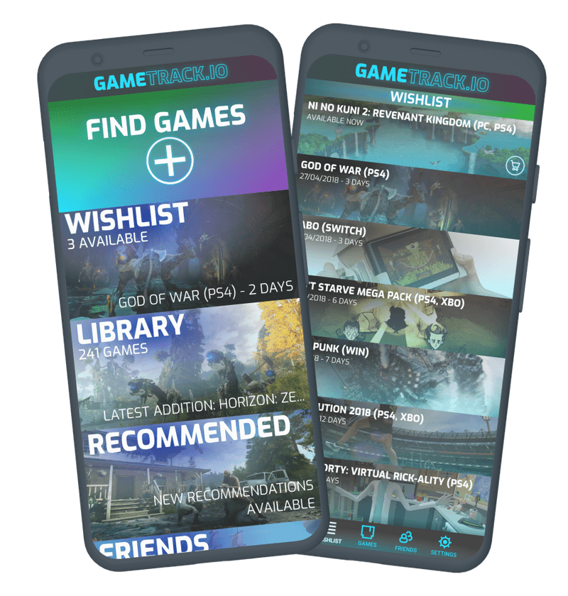
Visual Design
I wanted a style that would be relatively non-descript, as the artwork in the games themselves was incredibly diverse. I chose some key colours and decided on a neon style, which I could overlay over the key art of each game to help with artwork that would otherwise clash.
Where possible, I tried to keep the game art as prominent as possible. Not only did this showcase some great artwork, but it made it much easier for the user to navigate the app, as less reading is required if they recognise the artwork.
Clickable Prototype
To validate the product, I posted looking for tester's on social media, and sent them the clickable prototype below.
Clickable Prototype
To validate the product, I posted looking for tester's on social media, and sent them the clickable prototype below.
Clickable Prototype
To validate the product, I posted looking for tester's on social media, and sent them the clickable prototype below.
Switching to GameCase
Through testing GameTrack, I received really valuable feedback on what customers wanted from the product. In particular, more customisability and a more minimalist UI were comments that I heard many times. Furthermore, I'd linked up with a developer to begin building the app, so this was a natural opportunity to do a soft reset of the product.
I started to rebuild the app from scratch, focusing on redesigning flows that I had actionable, meaningful feedback on.

User Onboarding
One issue I'd uncovered with GameTrack is that it's new user experience was one size fits all. Gamers, and game collectors, can differ greatly in what games they're interested on, and what platforms they have available to them.
I rebuilt onboarding to ask the user about these preferences, so that the rest of the app would only present relevant information to them.

Lightweight Design
Much like with GameTrack, it was a priority to keep the games as the primary visual element of the app. I also used significantly more white space in the design, letting the artwork breath and making the typography clearer and easier to process.

Lightweight Design
Much like with GameTrack, it was a priority to keep the games as the primary visual element of the app. I also used significantly more white space in the design, letting the artwork breath and making the typography clearer and easier to process.

Lightweight Design
Much like with GameTrack, it was a priority to keep the games as the primary visual element of the app. I also used significantly more white space in the design, letting the artwork breath and making the typography clearer and easier to process.
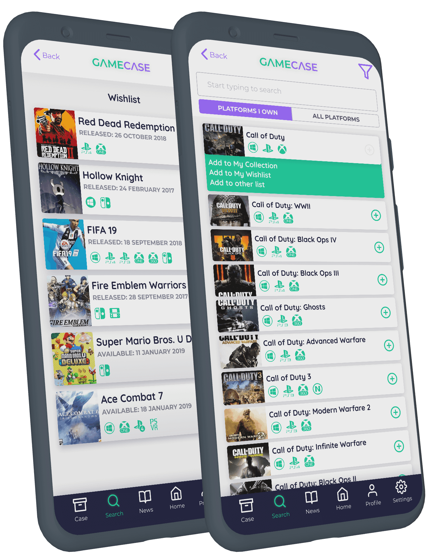
Lists
Much of the app involved ordered lists, and many actions in the app were triggered when viewing these lists. We spent a lot of time working on the layouts and functionality of these lists.
In particular, we found that clear iconography was an effective way of communicating information, rather than using type. This also allowed us to keep the elements lightweight.
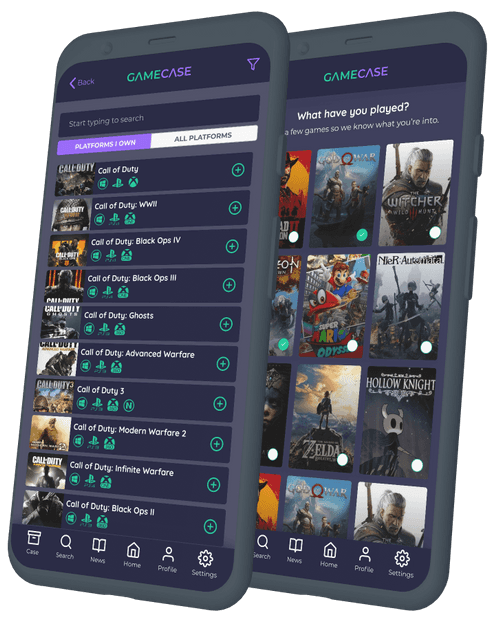
Dark Mode
A number of our testers noted that turning on the app during a gaming session can be a blinding experience, as they are often dimming the lights when playing. We'd built the app to be modular in it's design, so it was an easy piece of work to add a night mode.

Dark Mode
A number of our testers noted that turning on the app during a gaming session can be a blinding experience, as they are often dimming the lights when playing. We'd built the app to be modular in it's design, so it was an easy piece of work to add a night mode.

Dark Mode
A number of our testers noted that turning on the app during a gaming session can be a blinding experience, as they are often dimming the lights when playing. We'd built the app to be modular in it's design, so it was an easy piece of work to add a night mode.

